Case Study
Have WPP found the right blend of feelings in their design language to affectively tell their story?
Written by
Fri October 13
WPP like every brand, wants to say they are many things. In their case being:
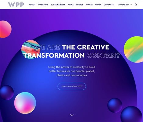
“The Creativity Transformation Company, using the power of creativity to build better futures for our people, planet, clients and communities.”
They also want to talk about being ‘extraordinary and exploring opportunities across their network to foster a culture of inclusion and openness’.
Communicating multiple ideas is never easy and compromises always have to be made. That’s why brands pay agencies like WPP to help them find the right balance in the design of their website or brand.
So, has one of the biggest brand agencies in the world done a good job on designing their own website?
Based on our research and data, YES and I want to share one particular reason why.
Their homepage contains 13 different feeling tones helping them communicate multiple stories from wisdom to networks. The most dominant tone is what we call the Visionary (triggered in the main by a blend of visionary colours illustrated in the orbiting planets). Our research would suggest however, that a better feeling tone to communicate the need for ‘transformation’ is its neighbour the Alchemist.
In theory therefore, if they want to put the emphasis on ‘Transformation’ they should have used the Alchemist as their dominant tone.
But because they want to add the idea of creativity into the blend, the Visionary is the right compromise. Why? Because our research shows the Visionary is a more common fit with the feeling tone of the Creative. Helping them communicate more easily a need for both Transformation + Creativity.